Update: Revisions at the bottom of this post
I'm Paul, a designer here at Stack Overflow and the designer working on the upcoming Sound Design site theme for you. I first want to thank you for your patience as I got pulled onto other projects after my initial post. I reviewed your responses to that post - and below you'll find the site design I came up with, based on your ideas and input.
Your site design
From the answers and comments on the original post, I understood that you wanted a simple and modern design and somewhat serious - at least something that reflected sound design as a profession, more than just sound listening. I therefore focused on a few elements from pro audio apps and I hope you'll see that reflected in the design.
Our SE themes are fairly simple (a logo, one color and a background image) so there is only so much we can do, but I believe I was able to at least hint toward this in an abstract way.
Color scheme
For the color scheme, I wanted to attempt to recreate the feeling being inside of a piece of audio creation software. I chose to set the background color to a shade of dark grey in order to feel like most of the pro audio software. Then, I set the text to a dark grey as well - as using color for text just didn't feel right when I looked at Logic Pro X, Ableton Live, Pro Tools, Sonar, etc. Then, the logo uses colors that are often used in sound editing software - greens, yellows, reds. Color in this way is saved for 'meaning'.
Logo
I found a logo that I believe is a balance between visually interesting, simple and professional. I tried several logo ideas but many were too busy, too gimmicky or ended up only feeling like listening. This logo reminded me of some of the images you sent me in that initial post.
I was able to find, purchase and then tweak and integrate this icon from the lovely Noun Project into your logo. I then used Noto Sans, an open source typeface. Any of the audio software I've seen uses sans-serif typefaces. And the Noto typeface is a very interesting project where they are attempting to be able to render most of the languages of Earth with this typeface. Felt like a cool way to represent the diversity of people working in the audio field.
Page design
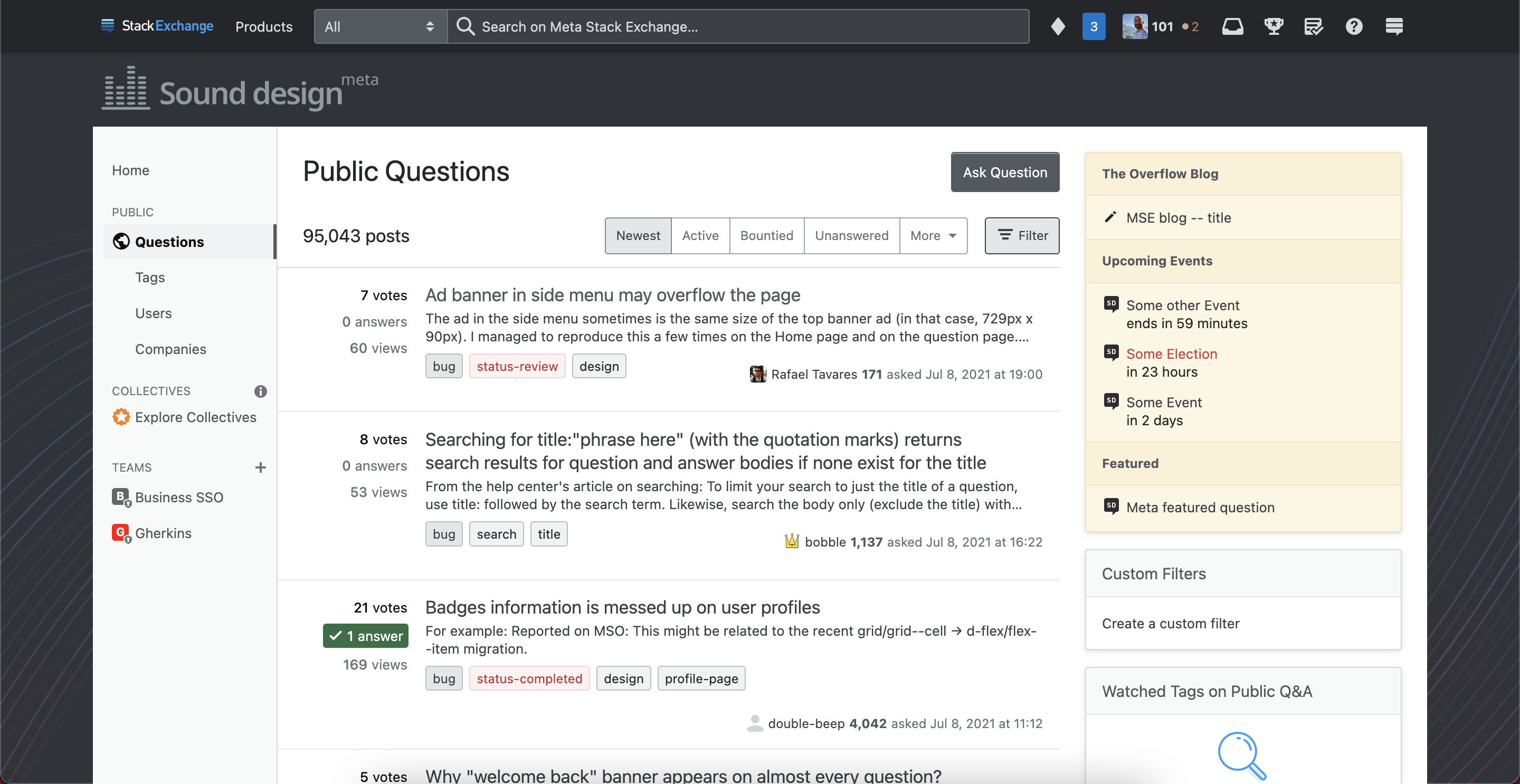
Putting all of these together, we get something like this:
And following our tradition of setting Meta in a similar design, but greyscale, we get:
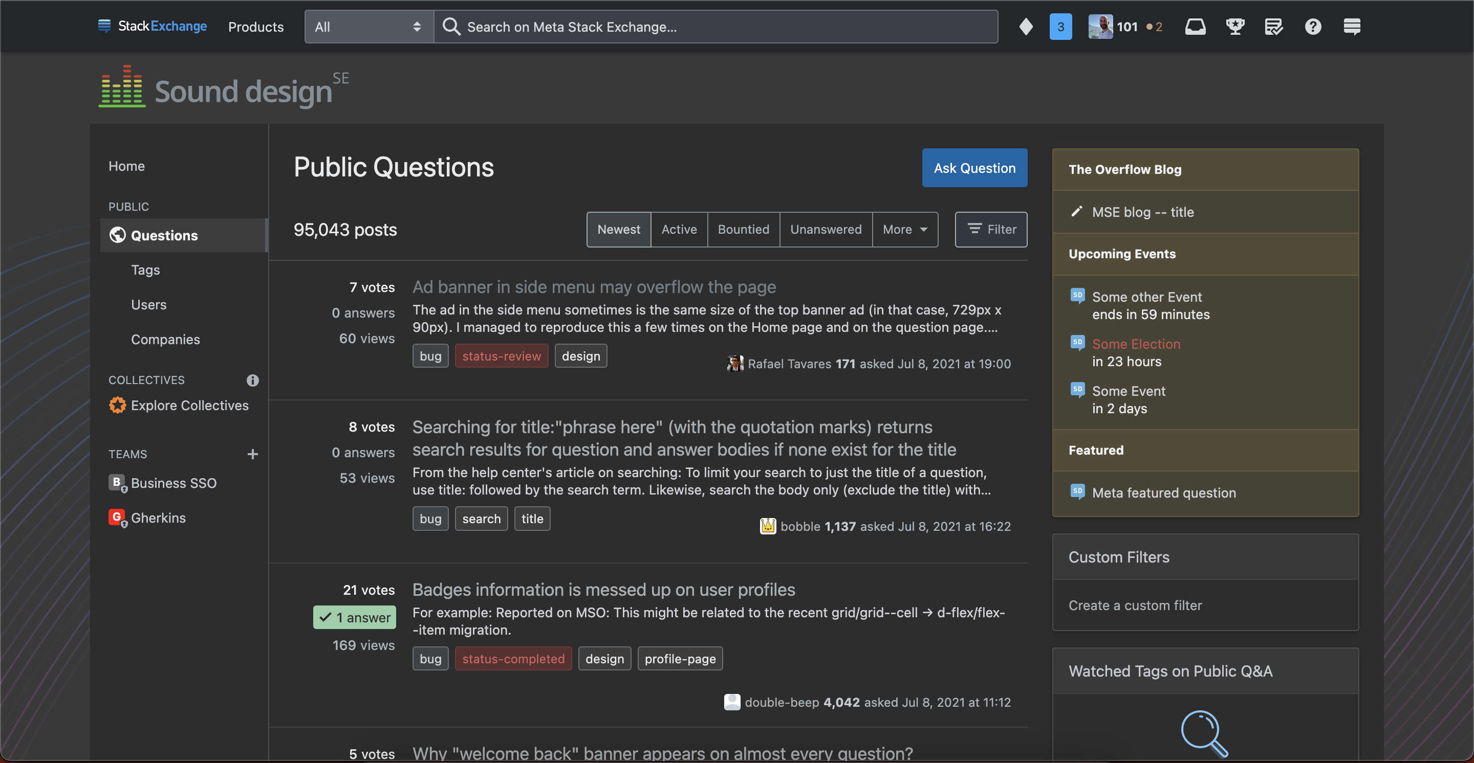
I also wanted to give you an easter egg, because you were so patient with me. Most sound design software seems almost set to permanent "dark mode" in that there is very little use of white for background colors. We don't officially support dark mode on SE sites as there are still some accessibility and other issues to iron out, but I went ahead and did a dark mode version of your theme:
If you add the theme-dark class to the body HTML, you will see this. I believe there are some browser extensions out there that might help with this.
You'll also notice a small hint toward an audio wave in the background as a small piece of visual interest.
We hope you enjoy this design, but if something doesn’t feel right, now is your chance to share your feedback. This window for feedback will be open for one week. We will then work to incorporate feedback as best as we can, finalize things on our end, and lastly, deliver the design to your site.
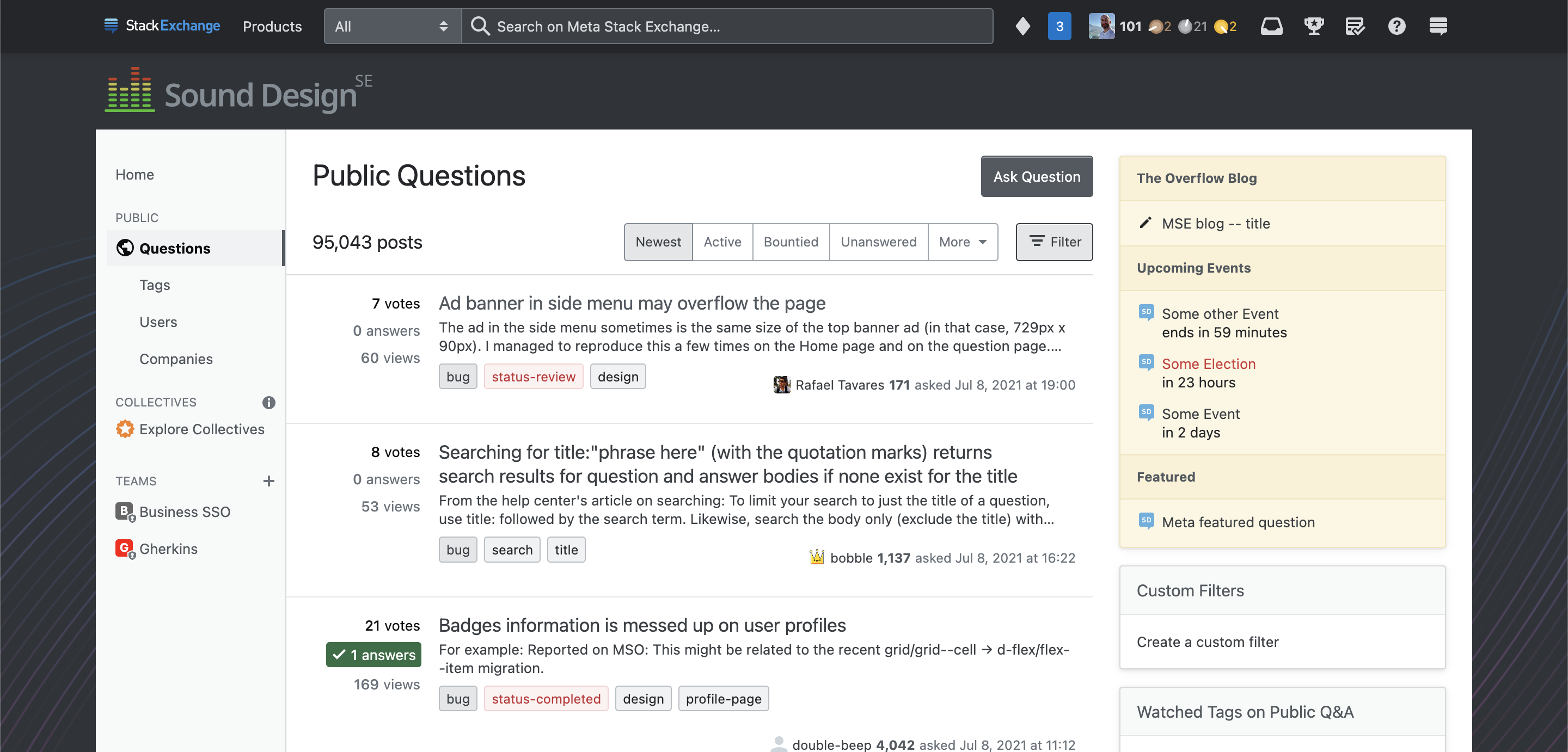
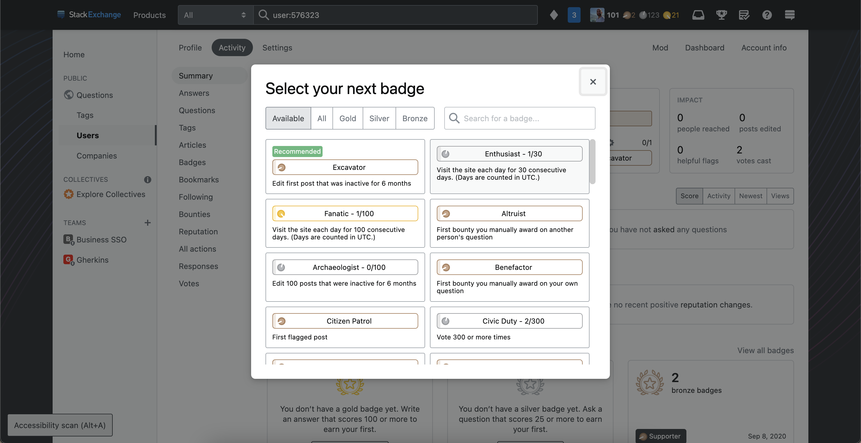
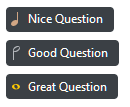
Update: Updated capitalization in the logo and did a badge design based on feedback.


